July 29th, 2019
Many non-profits have catalogs or mailings featuring mission-oriented items that are promoted during the holiday shopping season. By making them more interactive using QR codes or other triggering devices, printed catalogs can take the reader directly to a website with in-depth content to show the impact of the reader’s purchase on the organization’s mission.
We all know about Heifer International’s catalog that lands in our mailboxes each holiday season, along with UNICEF USA’s Inspired Gifts, CARE’s Gifts of Lasting Change, the World Wildlife Catalog and the Sierra Club’s Adopt a Wild Animal. Some of these catalogs sell branded clothing, cards and other gear, but their real purpose is to provide funding for lifesaving and life-changing actions or protect endangered species and wild lands.
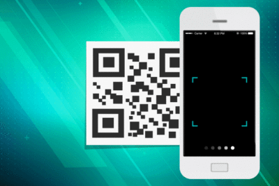
A QR code with a direct link to demonstrate the product or how its purchase can underwrite a mission-oriented activity takes the reader closer to the action. Viewing the impact can encourage additional product purchases or help develop an in-depth understanding of how the non-profit works to deliver change.
Video’s combination of sound and movement provide a richer sensory experience, deeper engagement, and can be more emotionally “sticky.”
The link should be preferably to video, which has become the storytelling medium of choice. Unless a photograph is incredible (like the Pulitzer Prize winning photos of “napalm girl” by Nick Ut or the haunting “vulture and starving girl” by Kevin Carter), most readers and viewers prefer video for a more immersive experience. Video’s combination of sound and movement provide a richer sensory experience, deeper engagement, and can be more emotionally “sticky.” A recent study by eMarketer found that four times as many consumers would rather watch a video about a product than read about it—perhaps that’s why so many Amazon listings have video demonstrations.
Since most readers have their smartphone nearby (where is yours at this moment?), video in vertical format should be your choice for QR code links in your catalog. Smartphones, Facebook, Instagram, Snapchat and Twitter have accustomed us to viewing and shooting video vertically, making it the orientation of choice. Unfortunately, these formats have also led to an incredibly short attention span—the average video length on Facebook is less than a minute, so be prepared to show your product in action almost immediately.
Best of all, the US Postal Service is encouraging mailers to integrate their direct mail pieces with mobile technologies for a more convenient online shopping experience. Non-profit catalog mailings that incorporate digital technologies are eligible for an upfront 2% postage discount during the 2019 promotion period running from August 1 through December 31. Claim your discount and bring your shopping experience to life!
Blog written by Ron Bell | Managing Partner and Founder
